Our writing style guide is where you’ll find fascinating insights such as when to use an em-dash, how to spell PhD and where we stand on exciting grammatical dilemmas including when to use italics, how to handle possessives and the ups and downs of capitalization. Refer to it here (internal only).
Logo
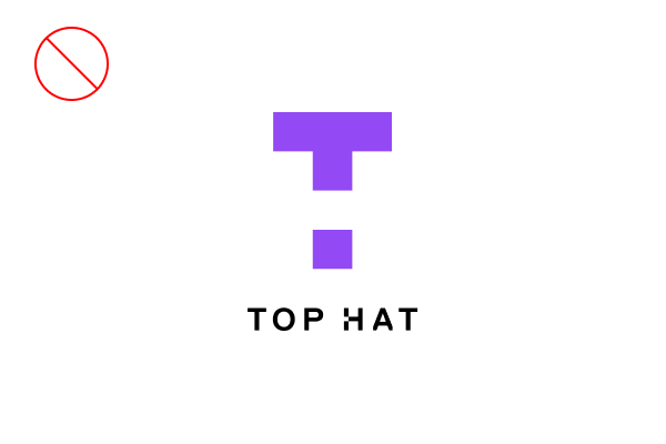
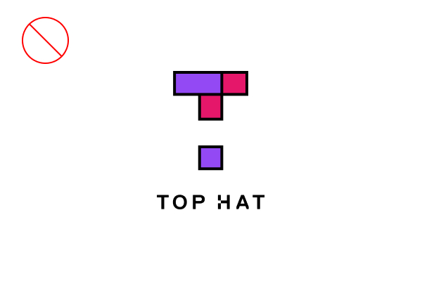
The Top Hat logo has been carefully crafted. It is the core symbol of our brand identity and the principal visual reference for our audiences. For this reason, consistency of logo use is imperative.
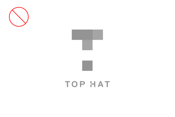
The Top Hat mark consists of five squares arranged to form a T (three purple and two pink), with negative space to form an H. The wordmark is set in Replica Bold, with a square notch in the H. The monocolor version is different, and adds separation to preserve the use of two colors from the full-color version.
Lockup
The lockup is the preferred option for Top Hat branded materials. It should be used whenever possible.


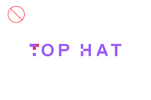
Wordmark
The wordmark is used when space is limited, or when the layout requires a horizontal logo.


Monocolor
This version is only used when a full-color application isn't possible. It should never be used as the default.


Icon Only
The Top Hat brand icon can be used independently from the wordmark, but only if the wordmark or full logo is clearly visible elsewhere on the material.
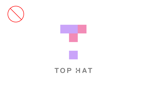
Logo No-nos
Our brand needs to remain consistent at all times. If you are using the Top Hat logo, wordmark or icon properly, there is no reason to modify them. Here are some tips.
-
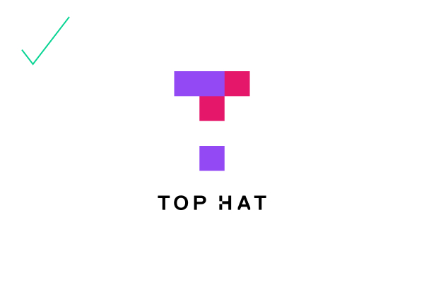
Use the full color lockup whenever possible
-
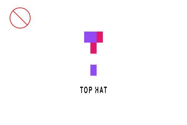
Do not stretch the logo vertically
-
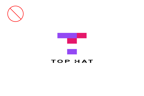
Do not stretch the logo horizontally
-
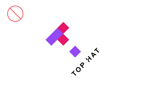
Do not rotate the logo
-
Do not fade the logo
-
Do not make the full-color logo one color
-
Do not grayscale the logo
-
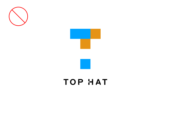
Do not modify the logo's colors
-
Do not modify the elements of the logo, icon, or wordmark
-
Do not add drop shadows, strokes or other treatments to the logo
-
Do not place the logo on a busy background
-
Do not place the logo on a purple or pink background
Miniumum Sizes and Safe Margins
Given the different permutations of our logo along with viewing distances, printing processes and resolutions, here are some recommendations for minimum sizing. It is your job to ensure that, once produced, all the elements and features of the logo are clearly legible and accurate.
When reproducing the logo in print, the minimum size is 0.625". For online use, the minimum size is 100 pixels at 72 dpi.
Color
To ensure correct reproduction, Pantone, CMYK, RGB, HEX numbers have been assigned to the colors noted. Please refer to the color breakdown values as listed in each swatch.
Main Colors
Top Hat's corporate colors are used in our main communications.
Top Hat Purple
PMS 2592
CMYK 60 74 0 0
RGB 147 74 244
HEX #934AF4
Top Hat Pink
PMS 213
CMYK 4 99 33 0
RGB 229 22 107
HEX #E5166B
Black
PMS BLACK
CMYK 0 0 0 100
RGB 0 0 0
HEX #000000
White
PMS N/A
CMYK 0 0 0 0
RGB 255 255 255
HEX #FFFFFF
Secondary Colors
Top Hat's secondary colors are used for expression.
Dark Purple
PMS 273 C
CMYK 17 28 0 65
RGB 45 17 89
HEX #2D1159
Orange
PMS 1225 C
CMYK 0 16 80 0
RGB 100 0 85 42
HEX #FFC146
Green
PMS 3395 C
CMYK 77 0 67 0
RGB 100 0 85 42
HEX #08D493
Blue
PMS 2727 C
CMYK 75 45 0 0
RGB 100 0 85 42
HEX #4384F7
Typography
We use Source Sans Pro whenever possible. It is a sans serif typeface intended to work well in user interfaces. It's free on Google Fonts.

Writing Style Guide
Writing for Top Hat? You might need an in-depth breakdown of the rules and regulations surrounding our grammar and house style.